Cluster Patterns
Cluster charts visualize order flow in a trader-friendly format, linked to standard Japanese candlesticks. They enable you to see a familiar chart but also provide the opportunity to look inside each candlestick to better understand what is happening at that moment.
The ATAS platform provides various types of cluster charts. For example, let's look at cluster patterns on a Volume chart. This chart type is straightforward yet highly effective for analyzing cluster patterns. To use it, open your cluster chart and select the Volume mode from the top-left panel.
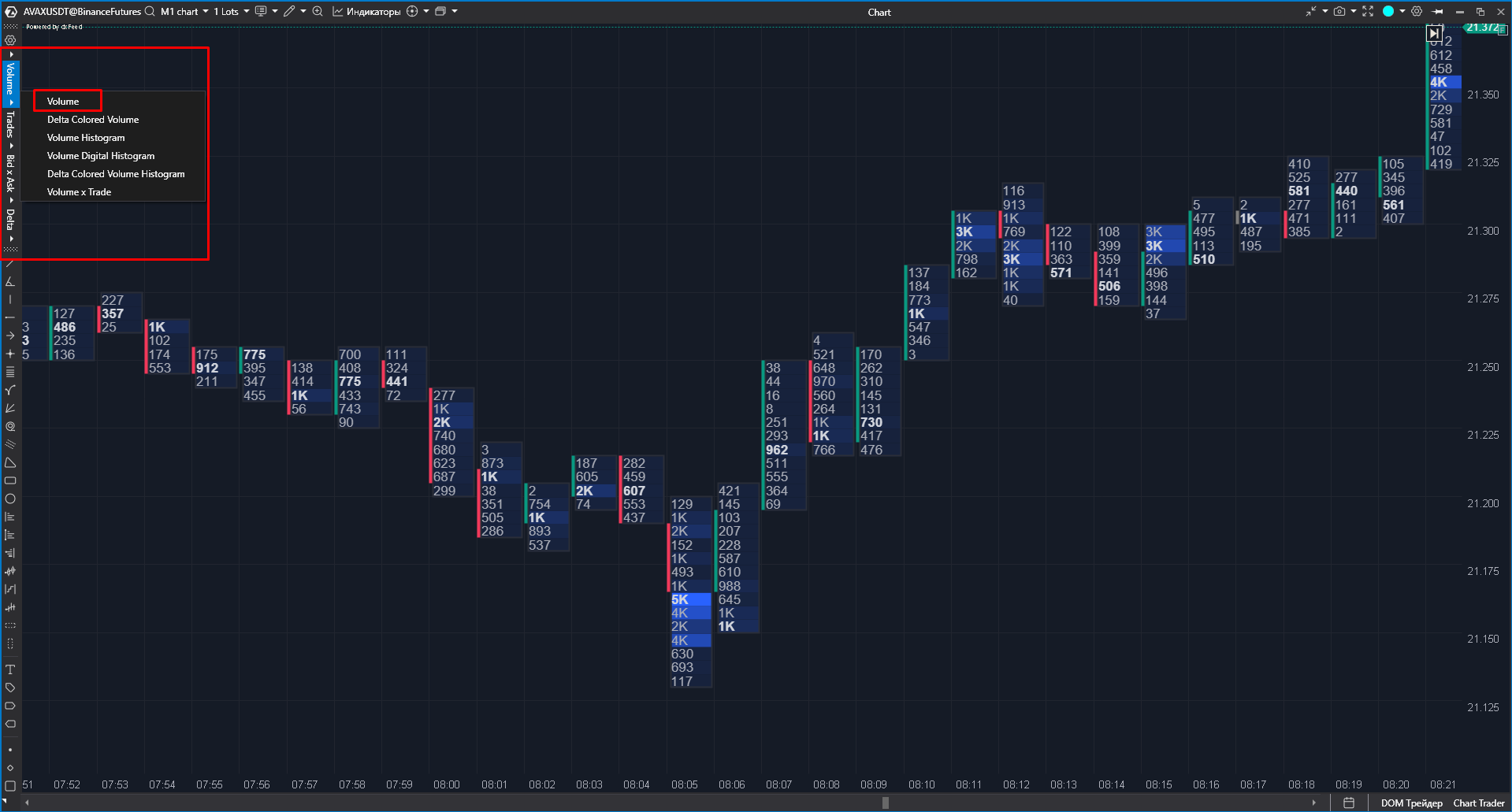
Volume charts display the amount of volume traded at each horizontal level (similar to a volume profile) for the time period represented by one Japanese candlestick. Moreover, ATAS colors each cluster with a gradient based on its volume, making it easier for traders to identify key volume points on the chart.
In general, cluster charts, including those using the Volume type, can be analyzed in various ways. In this manual, we will focus specifically on key candles and their combinations to help you understand who is stronger in the market at a given moment: buyers or sellers (especially during a retest of a particular level). This will help you identify entry triggers for the market.
Key candles can be classified into the following types:
strong buyer candle – the highest volume is located in the body or lower wick of the candle (if the price closes above the highest volume, it indicates that the buyer has achieved their goal for the moment and is currently in profit);

strong seller candle – the highest volume is located in the body or upper wick of the candle (if the price closes below the highest volume, it indicates the seller has hit their target and is now in profit);
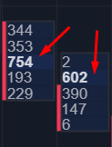
weak buyer candle – the highest volume is in the upper wick (if the price closes below the maximum volume, it shows the buyer has NOT reached their goal and is currently at a loss);

weak seller candle – the highest volume is concentrated in the lower wick (if the price closes above the highest volume, it suggests that the seller has NOT achieved their goal and is currently at a loss);

At any given moment (except for doji candles), we can assume which market participants are in control of the quote. To increase the chances of this assumption being accurate, you can look for combinations of key candles on the chart, which may signal a potential trend reversal, at least in the short term (particularly when aligned with a price level).
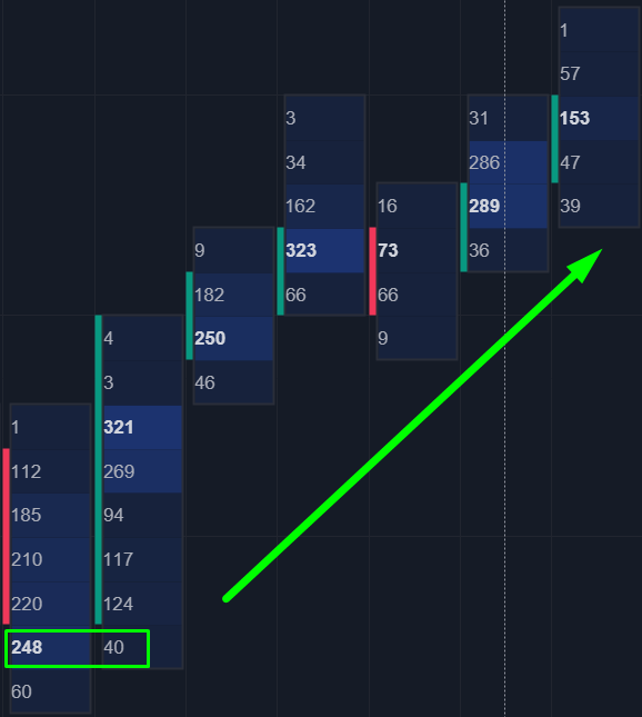
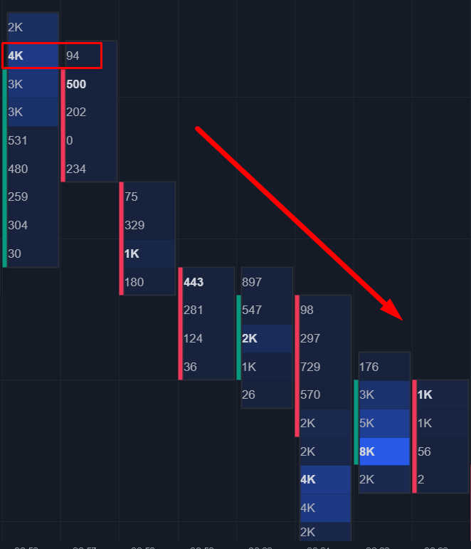
Based on this logic, if we see a weak buyer candle followed by a strong seller candle, it can indicate that the seller has taken control and the trend may reverse downward. Conversely, if a weak seller candle is followed by a strong buyer candle, it could signal that the buyer has gained control and the trend may reverse upward.
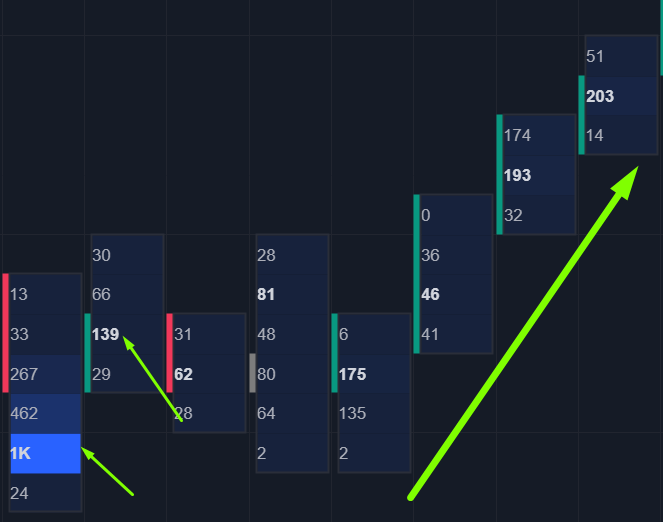
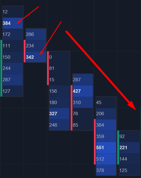
In a situation where a key candle of a strong buyer/seller tests the maximum volume of a weak seller/buyer’s key candle with its shadow, the chances of the pattern playing out increase significantly:
Additional factors that can enhance cluster patterns:
Presence of a volume level.
Alignment with the context of a higher time frame.
Combination with other cluster patterns.
Use of patterns on time frames higher than H1.
Integration with ATAS indicators (like CVD, etc.).
When you identify a cluster pattern, you can either enter a trade with a market order or place a limit order a few ticks above or below the closing price of the second candle that formed the pattern.
You can close a position:
when an opposing pattern appears;
at a significant level on the opposite side;
using a fixed take-profit order based on statistical analysis (ideally from 1 to 3).
The information above provides a solid foundation for starting to trade with volume analysis. We recommend testing all new strategies on historical data or a demo account to find a trading strategy that suits you before you start trading with real money. Wishing you successful trading!
Last updated